

In this tutorial we will show you how you can use icons on your visuals and filters in Power BI. In this post I will show you:
- Where you can get icons for your dimensions
- Linking the icon table to my facts
- Displaying icons in Power BI with Power Query
- Displaying icons in Power BI with DAX
- Adding icons to the visuals
- Conclusion
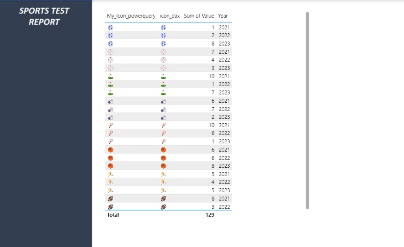
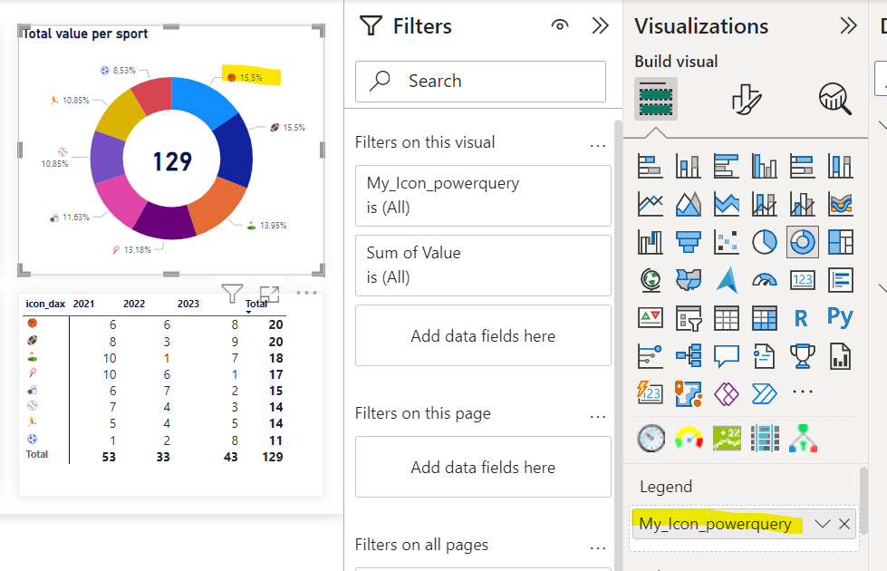
This is our end result:
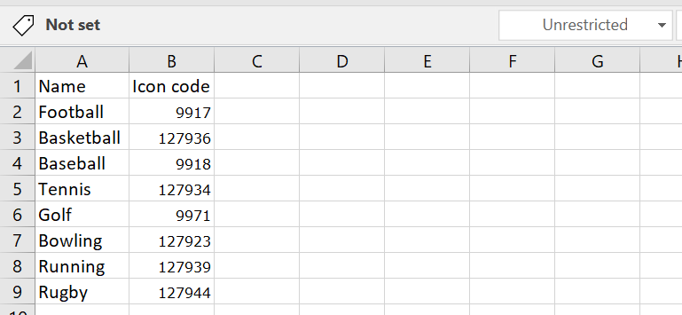
You can find the source data of this example below:
Getting icons
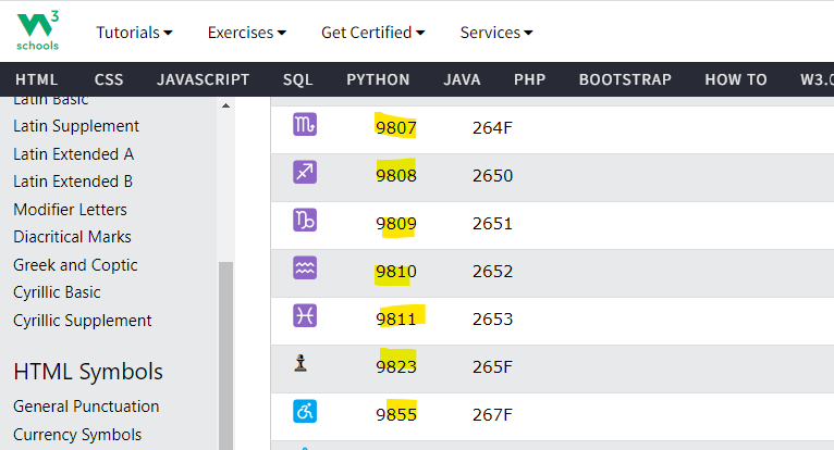
So how do we get these icons in Power BI? Well.. we can do that by adding the codes of icons in our source data tables (or creating a new table and linking that to our data). You can get the codes for icons on multiple sites. In this example I got the codes from the W3 library.
I now create a dimension table with all of my categories and the codes for the icons.
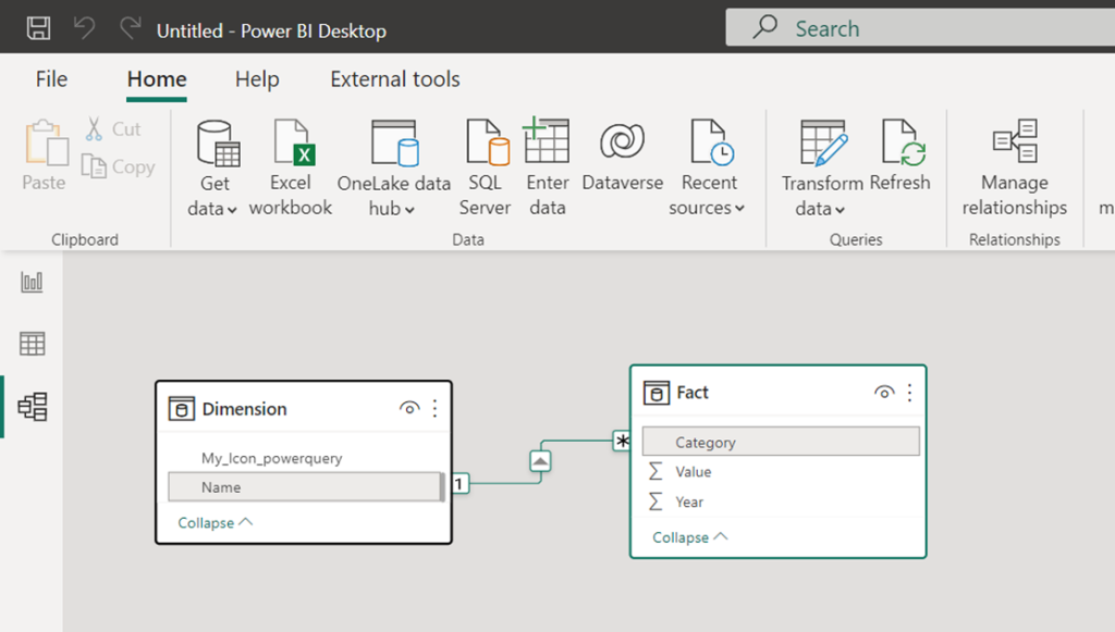
Linking our icon table to our data
I have made a connection with my Excel table in Power BI. I can now link my icon table to my facts in my Power BI model through the name. You do that with the relationships.
Next step: Making sure that we see the icons, and not the codes…
Displaying the icons in Power BI with Power Query
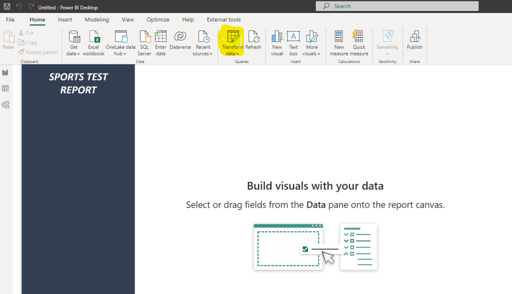
Now that the data is linked we can make sure that icons will be displayed instead of the codes. Let’s first show how to do this in Power Query. Go to Power Query in Power BI:
Add a custom column by clicking on Add column and then Custom column.
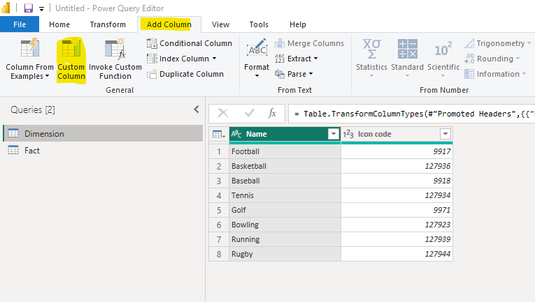
Use the formula below to change your codes to icons:
Character.FromNumber(<YOUR COLUMN WITH THE CODE>)We take the icon code and convert it to characters resulting into an icon!
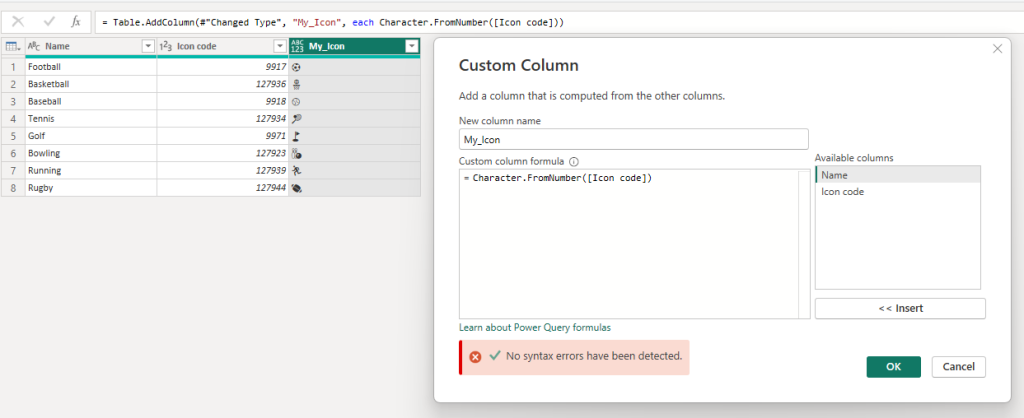
But wait… they are not in the color I expected…. No worries! When we close and apply our changes and create a table we will see the icons in the original colors of the W3 website.

Displaying the icons in Power BI using DAX
We can achieve the same result with DAX! Create a calculated column in the dimension tab of your report.
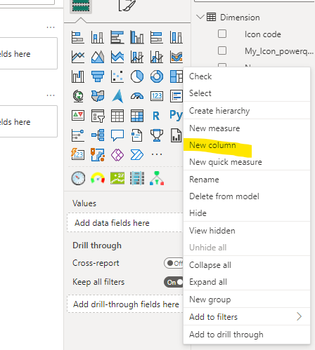
Use the DAX code below to create your icon:
icon_dax = UNICHAR(<YOUR COLUMN HERE>)You will see that we get the same result!
Personally I would do the transformations in Power Query since it is more convenient do to do all transformations in one place.
Adding icons to the visuals
Now that have our icon columns you can simply add them to your visuals and filters, and you will see the results!
Conclusion
I am not sure whether I would use icons in Power BI reports myself. Few reasons:
- It is more concise then text but it can also be very unclear what the meaning is.
- The icons I picked here are different colors, this is not ideal. If I would use them, it is critical to find matching icons in a neutral color.
- On filters it just looks a little bit off. As a user I would prefer to have the text values.
However, it can give a cleaner look and feel if you have professional icons, and it will solve the issue of long category names. In the example I like that I can use icons in my donut chart labels. Let me know what you think!