


In this tutorial series we build a full stack scheduling application with Python Django in the backend, and ReactJs in the frontend. In our previous post we explained the basic of React Router, the package that enables us to show certain components based on the web url. In this post we will continue and create an actual responsive navigation menu with the help of Material UI.
The full code can be found here. The working example is shown at the bottom of the post.
Material UI will make our lives a lot easier!
Material UI is a user interface library which provides components for React applications. They provide a lot of out of the box functionalities that would normally take a considerable amount of code to create yoursel. Material UI is very populair, and is used by big companies such as Spotify, Netflix, and NASA. More information is provided on their website.
In order to use Material UI, we will have to install some packages. Navigate to your frontend folder, and execute the following 2 commands:
(venv) PS C:\Users\nickm\Desktop\Scheduler\scheduler_project\frontend>
npm install @mui/material @emotion/react @emotion/styled
npm install @mui/icons-material
Creating our Navbar
We are now ready to create a Navbar. I have taken a basic example from the Material UI website, and I have tailored it to my specific needs. Create a new Navbar.js file in the components folder, and paste the following code in the file.
C:\Users\nickm\Desktop\Scheduler\scheduler_project\frontend\src\components\Navbar.js

import * as React from "react";
import PropTypes from "prop-types";
import { Link, useLocation } from "react-router-dom";
import AppBar from "@mui/material/AppBar";
import Box from "@mui/material/Box";
import Drawer from "@mui/material/Drawer";
import IconButton from "@mui/material/IconButton";
import List from "@mui/material/List";
import ListItem from "@mui/material/ListItem";
import ListItemIcon from "@mui/material/ListItemIcon";
import ListItemText from "@mui/material/ListItemText";
import MenuIcon from "@mui/icons-material/Menu";
import Toolbar from "@mui/material/Toolbar";
import Typography from "@mui/material/Typography";
import TodayIcon from "@mui/icons-material/Today";
import ScheduleIcon from "@mui/icons-material/Schedule";
import HomeIcon from "@mui/icons-material/Home";
import LanguageIcon from "@mui/icons-material/Language";

const drawerWidth = 220;
function Navbar(props) {
  const { window } = props;
  const [mobileOpen, setMobileOpen] = React.useState(false);
  const location = useLocation();
  const path = location.pathname


  const handleDrawerToggle = () => {
    setMobileOpen(!mobileOpen);
  };

  const drawer = (
    <div>
      <Toolbar />

      <List>
        <ListItem component={Link} to='/' button key={"1"} selected={'/' === path}>
          <ListItemIcon>
            <HomeIcon />
          </ListItemIcon>
          <ListItemText primary={"Home"} />
        </ListItem>

        <ListItem component={Link} to='/calendar' button key={"2"} selected={'/calendar' === path}>
          <ListItemIcon>
            <TodayIcon />
          </ListItemIcon>
          <ListItemText primary={"Calendar"} />
        </ListItem>

        <ListItem component={Link} to='/create' button key={"3"} selected={'/create' === path}>
          <ListItemIcon>
            <ScheduleIcon />
          </ListItemIcon>
          <ListItemText primary={"Schedule"} />
        </ListItem>

        <ListItem component={Link} to='//cbi-analytics.nl/' button key={"4"}>
          <ListItemIcon>
            <LanguageIcon />
          </ListItemIcon>
          <ListItemText primary={"Visit website"} />
        </ListItem>
      </List>
    </div>
  );

  const container =
    window !== undefined ? () => window().document.body : undefined;

  return (
    <Box sx={{ display: "flex" }}>
      <AppBar
        position="fixed"

        sx={{
          bgcolor : '#3B5998',
          width: "100%",
          zIndex: "999999"
        }}
      >
        <Toolbar>
          <IconButton
            color="inherit"
            aria-label="open drawer"
            edge="start"
            onClick={handleDrawerToggle}
            sx={{ mr: 2, display: { sm: "none" } }}
          >
            <MenuIcon />
          </IconButton>
          <Typography variant="h6" noWrap component="div">
            <Link to='/'> <img src={"/static/images/logo6.png"} alt="CBI Analytics Scheduler"/></Link>
          </Typography>
        </Toolbar>
      </AppBar>
      <Box
        component="nav"
        sx={{ width: { sm: drawerWidth }, flexShrink: { sm: 0 } }}
        aria-label="mailbox folders"
      >
        {/* The implementation can be swapped with js to avoid SEO duplication of links. */}
        <Drawer
          container={container}
          variant="temporary"
          open={mobileOpen}
          onClose={handleDrawerToggle}
          ModalProps={{
            keepMounted: true // Better open performance on mobile.
          }}
          sx={{
            display: { xs: "block", sm: "none" },
            "& .MuiDrawer-paper": {
              boxSizing: "border-box",
              width: drawerWidth
            }
          }}
        >
          {drawer}
        </Drawer>
        <Drawer
          variant="permanent"
          sx={{
            display: { xs: "none", sm: "block" },
            "& .MuiDrawer-paper": {
              boxSizing: "border-box",
              width: drawerWidth
            }
          }}
          open
        >
          {drawer}
        </Drawer>
      </Box>

        <Toolbar />

    </Box>
  );
}

Navbar.propTypes = {
  window: PropTypes.func
};

export default Navbar;
On top of the file we import all the components that we need to build our Navbar. Next, we see a constant named drawerWidth. This constant sets the width of our sidebar (drawer). If you change this number, the width will change accordingly.
Then, the function of Navbar is called. This function starts with several constants. Two of them are very important:
- Const location & path: Makes sure that we know what the url of our current page is. This way we can determine which navigation item needs to be selected once we are on a page.
- Const drawer: Here we defined several list items. These are the items we will see on our sidebar. Each ListItem has an icon and a text. All the icons can be found on the website of Material UI. The ListItem has a component of Link, which allows us to specify the link of the page it should navigate to. Within each ListItem you will see the variable selected along with a conditional statement. If the path is equal to the current url we want the ListItem to be selected.
The return statement then provides the standard code of Material UI. In the Appbar component I changed the backgroundcolor. The rest is similar to the code of Material UI.
I also added a logo on the top left of the Navbar. If you do not want this, please delete the img tag in the code, and replace it by some text. If you do want to use the image, dowload it below and store it in this location: Scheduler\scheduler_project\frontend\static\images.
Importing our Navbar in our App.js file
We have created our Navbar, but it is not yet shown on our app. We need to import the Navbar to our App.js file, and place it in our return statement of this file. Add the bold code from the code block below.
C:\Users\nickm\Desktop\Scheduler\scheduler_project\frontend\src\App.js
import React, { Component } from "react"
import {render} from "react-dom"
import { BrowserRouter as Router, Routes, Route} from 'react-router-dom';
import Home from "./components/Home";
import Calendar from "./components/Calendar";
import CreateEvent from "./components/CreateEvent";
import Navbar from "./components/Navbar";

function App(props) {
    return (
        <Router>
            <Navbar/>
            <Routes>

                <Route path='/' element={<Home/>} />
                <Route path='/calendar' element={<Calendar/>} />
                <Route path='/create' element={<CreateEvent/>} />
            </Routes>

        </Router>
    );
  }

  export default App;

const appDiv = document.getElementById("app");
render(<App />, appDiv);
Check the result in the server
Now the Navbar should show in our application. Start your server, and check out the result! You will see that our Navbar is appearing.
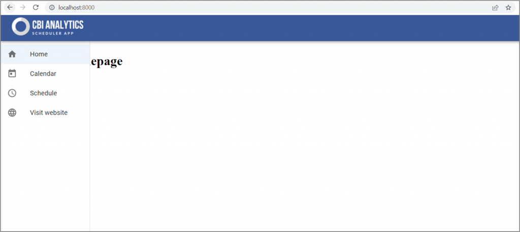
One slight issue, the text of our pages is diplayed our Navbar. Let’s fix that!
Create component that holds our content
In order to display all of our content correct we can create a component that will allocate a width and a margin to the left for all of our pages. There we also need to take into account that our navbar is responsive, and that the side menu will disappear at 600 pixels width. So we need to make a component that:
- Has a margin left of the width of our side menu when the screen is more than 600 pixels.
- Has a width of 100% minus the width of our side menu when the screen is more than 600 pixels.
- Has no margin left and a width of 100% when the screen is smaller than 600 pixels.
Create a new file in the components folder named Content.js.
scheduler_project\frontend\src\components\Content.js

import * as React from 'react';
import { styled } from '@mui/system';

const drawerWidth = 220;

const ContentHolder = styled('div')({
  width: '100%',
  '@media screen and (min-width: 600px)': {
    width: `calc(100% - ${drawerWidth}px)`,
    marginLeft: drawerWidth,
  },

});

export default ContentHolder
We start with mentioning the width of our side menu (drawerWidth). This is incremental, since this number decides what the margin to our content is. Next we create a styled constant named ContentHolder. This component has a default width of 100%. When the min-width is 600 pixels (breakpoint of our side menu), the width of the content space is 100% minus the drawerWidth (width of the side menu). In addition, we state that the margin left is the drawerWidth.
Why this additional component? We could also allocate css or sx styling to each individual file but that is very timeconsuming. By creating our own component with the styling added we are able to simply call the component in each file to get the desired result.
Adding our new component
We now need to import this component into our JS files, and wrap each return statement with this component. That way, our app will behave the way we would like. Below an example of what our Home.js file looks like after the import of our component. Add the bold code to the Home.js, Calendar.js, and CreateEvent.js files.
scheduler_project\frontend\src\components\Home.js

import React from 'react';
import PropTypes from 'prop-types';
import ContentHolder from './Content';

function Home(props) {
  return (
    <ContentHolder>
      <h1> This is our homepage</h1>
    </ContentHolder>
  );
}

Home.propTypes = {
  window: PropTypes.func,
};

export default Home;
Navbar is ready and responsive!
We have now completed the design of the navbar. In the video below you can see the end result. The content will be placed next to our side menu, and when the side menu disappears the width of the content will be full page.
Next post: User interface of our application.
In the next tutorial we will start with the creation of the user interface for scheduling appointments. This UI will consist of some stat blocks, forms, and buttons.