

In this blog post we describe how users can create a hierarchy on the x-axis of their graphs. By default, Power BI concatenates the text labels in visuals which is unreadable if you want to include two categories on 1 axis. By changing some simple settings, you are able to split the two categories in a hierarchy, providing end users with better insights!
In this post we will show you how to create these hierarchies with dates and text attributes. In our dashboard we use a small Excel dataset included below. The embedded dashboard shows the final result with date and text hierarchies.
Our end result:
Creating hierarchies with dates
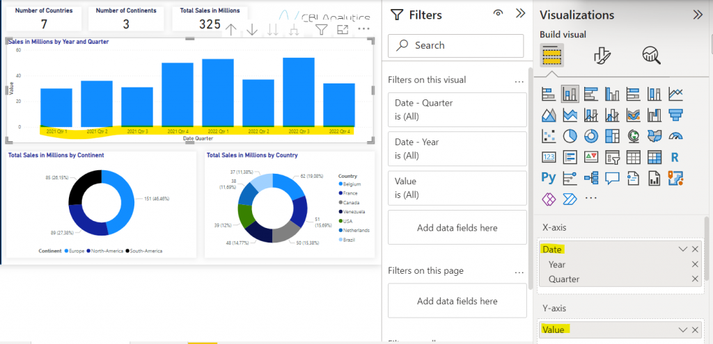
In Power BI I created an overview with a year and quarter, originating from my date hierarchy. In the yellow area you see the concatenated labels.
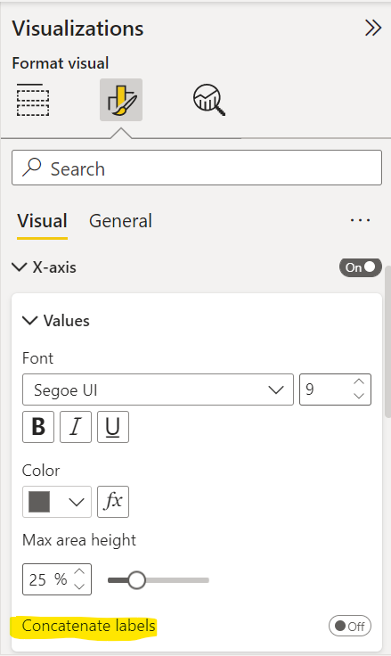
If I want to get the quarter and year in a hierarchy, I can do that by turning off one simple setting. Go into the visual settings, go to x-axis, and turn-off the concatenate labels setting.
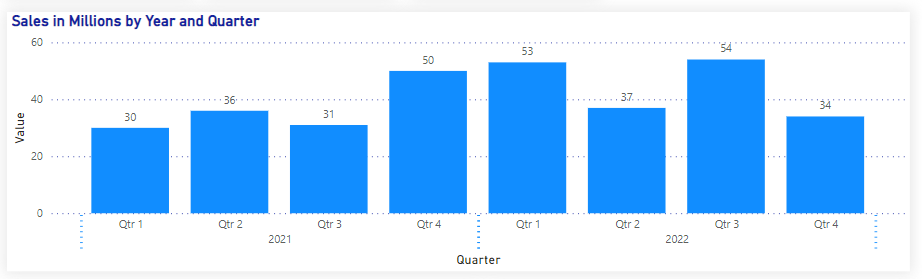
You will notice that your graph immediately shows a hierarchy instead of a concatenated view.
Creating hierarchies with text fields
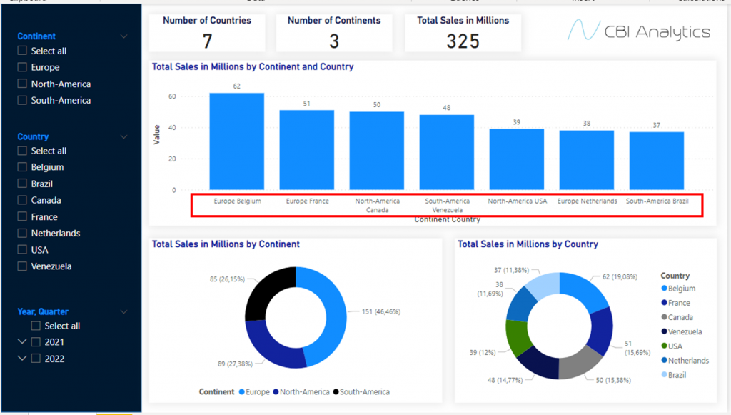
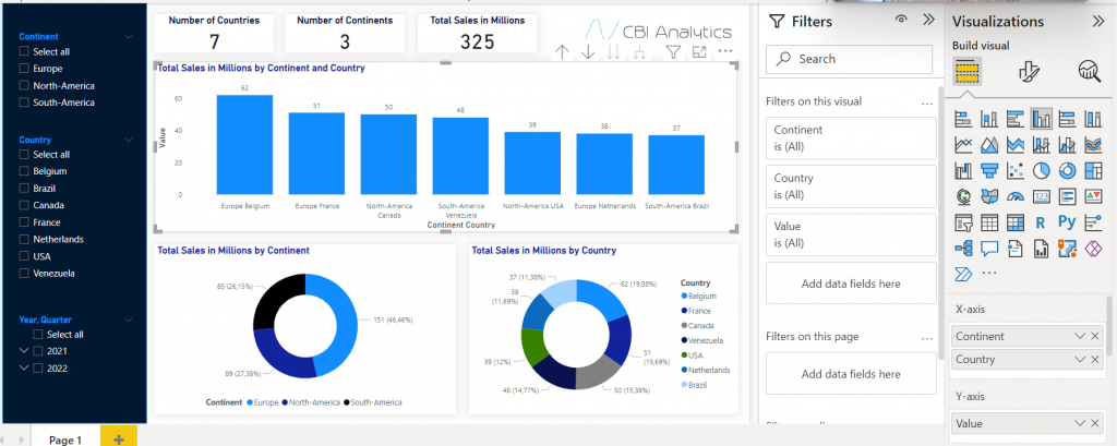
Creating a hierarchy with text columns requires 1 additional task. In Power BI desktop we have created a view with a country and continent on the x-axis, and the value on the y-axis. In the current setup it looks like this.
In order to create nested hierarchies with the continent and country name, we need to do two things.
First: Similar to the dates example, go to the settings of the visual, go to x-axis, and turn off the concatenate labels switch. This will in the end make sure that we do not have the labels stuck to each other.
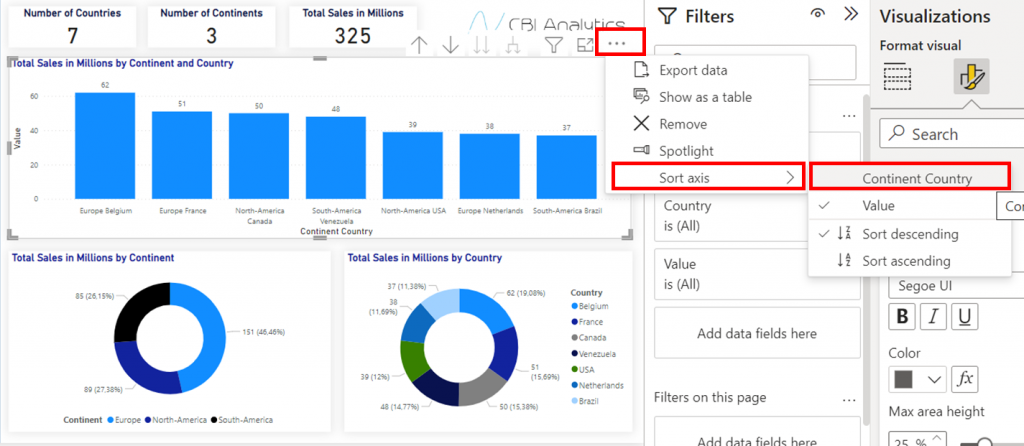
Second: You need to sort the axis according to the nested . Click on the settings (three dots), click on sort axis, and then select continent country.
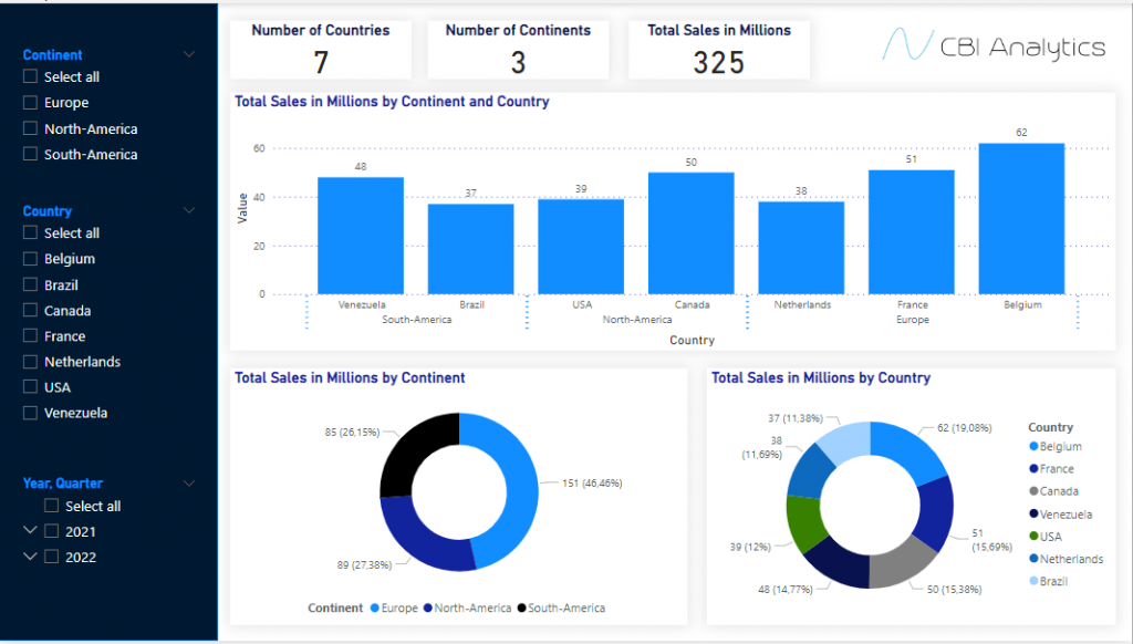
In your visual you will now see a clear split in the hierarchies in the visual!
Now you have hierarchies!
We are now able to create hierarchies, providing users with better visuals in the reports!